Design Basics: What Makes a Design User-Friendly and Effective
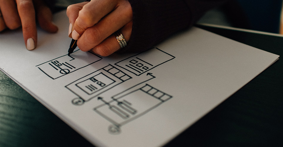
In a world where attention spans are short and competition is fierce, design isn’t just about aesthetics — it’s about usability, clarity, and creating a delightful experience. Whether you're building a website, mobile app, or brand identity, the foundation lies in applying a few timeless design principles.
Here’s a breakdown of essential design basics that can help you create better, more user-friendly interfaces.
Visual Hierarchy: Show What Matters
Visual hierarchy guides users by showing what’s most important. You can establish hierarchy using:
- Size: Bigger = more important
- Color: Bright or bold colors draw attention
- Position: Top and center elements get more visibility
- Contrast: High contrast helps key elements stand out
A strong hierarchy makes content easier to scan and interactions more intuitive.
Law of Proximity: Group with Purpose
Humans are wired to seek patterns. When elements are placed close to each other, we perceive them as related — even if they look different. This is the law of proximity, a core principle of Gestalt psychology.
Use spacing to visually group related items — such as labels with form fields, or headings with body text — and separate unrelated ones. This helps users understand structure without needing to think.
Consistent Spacing & the 4-Point Grid System
Spacing isn’t just about making things “look nice”; it brings order and rhythm. A 4-point grid system ensures consistency across paddings, margins, and element alignment. Everything fits in multiples of 4 — 4px, 8px, 16px, 32px — making designs feel balanced and scalable across screen sizes.
Consistent spacing also makes development smoother, reducing guesswork during handoff.
Typography: The Silent Hero
Typography plays a silent yet powerful role in user experience. Good type choices enhance readability, convey tone, and guide the user’s eye.
Some quick tips:
- Use a clear hierarchy: Headings > Subheadings > Body.
- Limit yourself to 1–2 font families.
- Maintain consistent line height and letter spacing.
Remember: if users struggle to read, they won’t engage — no matter how great the content.
Colour Psychology: More Than Just Pretty Hues
Colors do more than decorate — they communicate. Color psychology taps into emotional responses and brand perception.
- Blue: Trust, calm, professionalism (used by tech and finance brands)
- Red: Energy, urgency, passion
- Green: Growth, nature, stability
- Yellow: Optimism, warmth, creativity
Be intentional with your color palette, and ensure sufficient contrast for accessibility.
Z & F Reading Patterns
Users don’t read — they scan. Understanding natural eye movements helps design more intuitive layouts.
- Z-pattern: Ideal for simpler pages (like hero sections or landing pages). Users scan in a Z-shape — top left → top right → bottom left → bottom right.
- F-pattern: Common on content-heavy pages like blogs or news sites. Users read across the top, then scan down the left side.
Design with these patterns in mind to place key elements — headlines, CTAs, logos — where they’ll get noticed.
Conclusion: Design is Human-Centered
Great design isn’t about being flashy — it’s about being intentional. It solves problems, respects the user’s time, and communicates clearly. By applying these basic principles, you can create interfaces that don’t just look good — they feel right.
Whether you’re a beginner or a seasoned designer revisiting the basics, these timeless foundations will always elevate your work.